Watercolor sketches of a little old cart and a koi

I don't know how old this little cart is, or where it was made, but it's full of rustic charm and very fragile.

Also here is a recent watercolor and gouache sketch of a koi, using Daniel Smith's Cascade Green and Undersea Green in the background. I really loved using these colors and the beautiful effects they produce. I also used some  Perylene Green for the very darkest green close to the body at the bottom of the koi. The koi is painted with gouache.

Here are some in-progress photos:

Koi sketch in progress

Koi sketch in progress

Koi sketch in progress

Koi sketch in progress

Little old cart watercolor sketch

Little old cart watercolor sketch

Koi, watercolor and gouache, 5x7"

Koi, watercolor and gouache, 5x7"

Gouache Color Study

Color study of Marie-Gabrielle Capet self-portrait

Color study of Marie-Gabrielle Capet self-portrait

Here's a small gouache color study (4.75"x6") painted using a limited palette of primary red, yellow, blue, black and white on Fabriano Artistico hot press paper. I used Winsor & Newton Designers Gouache set of six primary colors. 


Initial pencil drawing

Initial pencil drawing

image.jpg
image.jpg
image.jpg
image.jpg
image.jpg

#gouache #colorstudy finished 4.75"x6"

A photo posted by Carol Pascale (@pascalestudio) on

A Painting in Progress

Oil on Arches oil paper, 4" x 4.5"

Oil on Arches oil paper, 4" x 4.5"

Progress steps

Progress steps

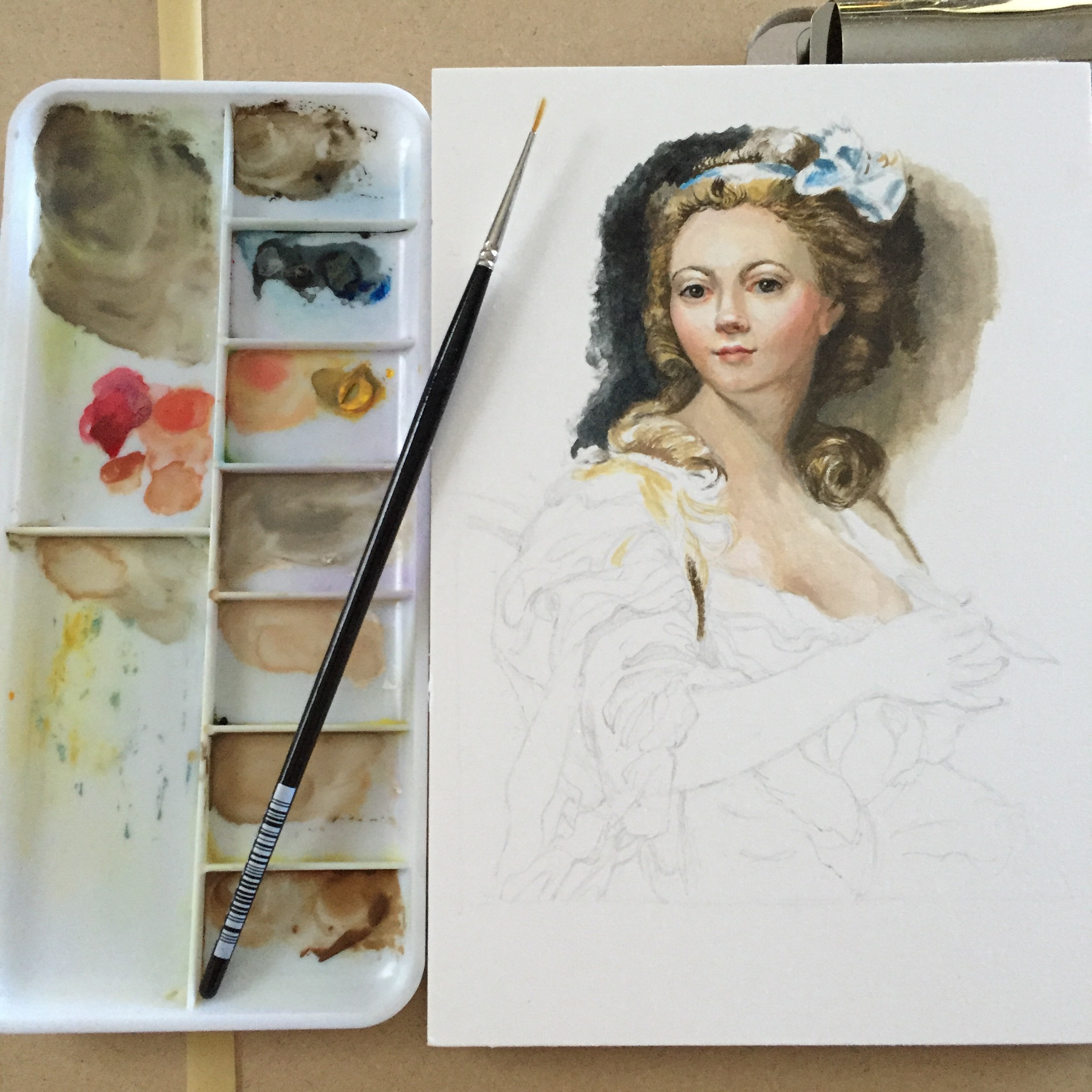
I've painted this little pitcher before with strawberries. I love how the light from above reflects off the gilded table top and illuminates the gold luster on the bottom of the pitcher.

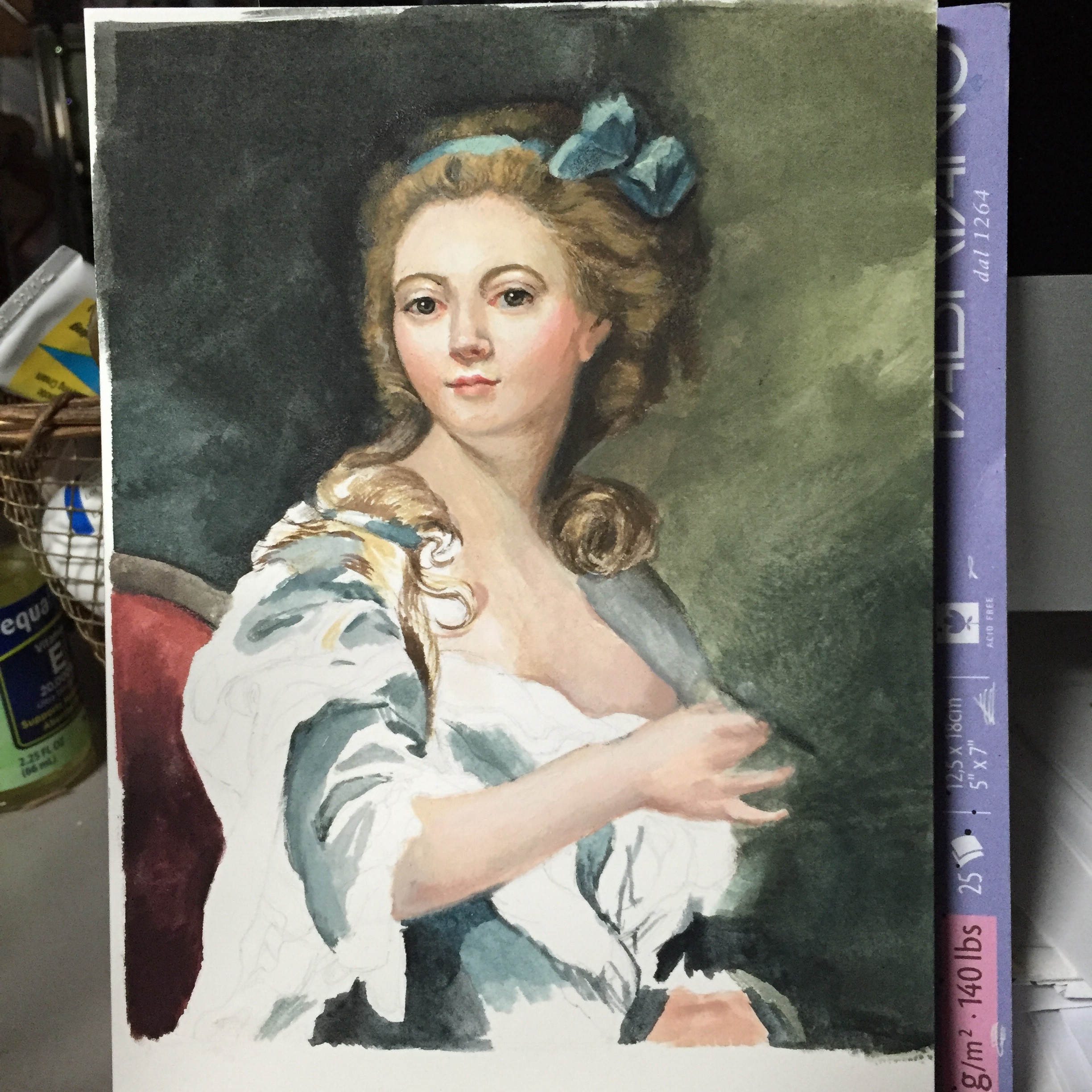
The paper was prepared with a light coat of a neutral gray gesso so I could begin analyzing the relationships of value and color temperature from this middle value. I took comparative measurements of height to width and sketched in the jug lightly with a white charcoal pencil, analyzing all the relationships of horizontals, verticals, angles and negative shapes as I went. 

As I started to proceed with paint, I could see that the inside of the jug was about a middle value 5, but the temperature was slightly warmer. I arrived at this conclusion by placing my neutral gray gessoed paper behind the jug and deciding if the gray inside the jug looked warmer or cooler. Once I established this, I used it as a point of comparison to begin finding all the subtle value changes that would describe the form of the jug. I placed the brightest white highlights, some of the warm background color, the deep red around the rim and the darkest umber shadow under the jug. From there it was a lot of squinting to see how each value compared to all the other values and making adjustments where necessary.